Before I get into the next Development Diary entry for Deathfire, I wanted to point you all to a new interview with me on The Nerd Cave. It is an interesting – I think – look at the different aspects of my career, not only the games most people are familiar with. But now back to our regularly scheduled programming… more Deathfire stuff. ![]()
It is a common occurrence in game development that you have to make design decisions based on incomplete information. Why? Well, because at the time you design many aspects of a game, the game itself does not really exist yet. You are merely projecting what you want it to be. Therefore you have to make a great many decisions based on whatever information you have at the time, and what you expect the gameplay to be like in the final product. It is probably hard to imagine for many people, but game design is a very iterative process. Especially as the complexity of the game and underlying systems grow, the requirements will most likely change as well. Somewhere down the line, play testing may show flaws and weaknesses that will have to be addressed, or entire parts of the system show themselves to be flawed, tedious or outright un-fun. No one has ever designed the perfect role playing game in a single attempt, ever. You make decision, rethink them, revise them, reiterate them, adapt them and then repeat the entire process until one day you ship a product.
While working on Deathfire, the other day we stumbled into such a scenario, which I think illustrates this very nicely in an easy to understand manner. The item in question were the character status boxes.
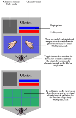 These small user interface elements serve to give the player a quick overview over the characters in his party, their health, their mana, their condition, etc. They also allow the player to access more information and to make various character-specific selections, such as attacks and spells, among other things.
I made a list of components I felt needed to be part of this character box, mocked it up very quickly in Photoshop, and forwarded it to Marian so that he could think of a proper graphical representation for them. Instantly the question for him became, “Should we do it this way, or maybe make tall slim boxes, or rather wider ones?”
He worked out some ideas and showed them to the rest of the team. You can see the initial designs below. As you can see, they follow the same kind of general design pattern, but each version is created with a specific focus in mind. One focuses on the portrait, while another one favors the attack and spell slots, and so forth.
Once we saw these, it became clear that with our original premise, these boxes would use up a significant amount of screen real estate. Deathfire will have a party that consists of four heroes. In addition to that, the player can recruit two additional NPCs at any given time, resulting in six character boxes on the screen. With all the information displayed, this a not insignificant amount of screen real estate to deal with and the last thing you want is for these boxes to cover up vital areas of gameplay.

First versions of the character status box that we evaluated
While these were great first attempts, they felt a bit too design heavy and not what you would really need in the actual game. In addition, the important elements seemed to be drowned out a bit by the bulky borders and decorative elements. In a word, we felt we weren’t quite there yet. We decided that we needed to optimize this somehow and for that we needed to envision more clearly how the player is going to play the game. While we have the game engine up and running with our 3D environments and some basic core functionality, we have yet to reach the point in our prototype where it is possible to really get a feel for the way the game will play in the end. Therefore, we had to extrapolate and sort of play the game in our minds, and as we did so, a few things became obvious.
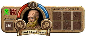
An iteration of the character status box, but we felt it ran too wide.
Note, however, the lines are all much slimmer than before.
This is not final art and the portrait is merely a mock-up
There was a lot of stuff in those original character boxes that we didn’t really need. At least not all the time. So we thought that maybe we could create boxes the display the minimum of information and when the player moves the mouse over them, each respective box will expand to its full size, allowing access to the full set of features. The next step was for us to decide what that minimum of information actually is that we need to relay to the player at all times.
 Do you really need the character’s name, for example, all the time? One could argue that the portrait is enough, particularly if we allow players to customize them the way we have in mind, but since we are creating a game in which interaction with NPCs and among the party members themselves will be very frequent, we felt that it is, in fact, very important that the player always has an indication as to who is who, when they are being referenced by name.
But what about those attack and spell slots? Because we have a turn-based combat system in Deathfire, it is not essential for us to give the player instant access to his weapons and spells. In real time combat, yes, the player needs access to his weapons, which represent the attacks, within a fraction of a second, but in real-time combat, the combatants take turns, which means there is proper time for the player to make his selections without rushing things. If we automatically expand the box for the character whose turn it is, this should turn out to be pretty slick and efficient, actually, also serving as a visual guide as to whose turn it is.
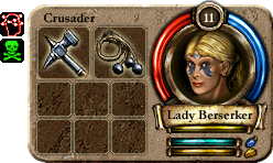
The expanded character status box with weapons equipped.
Note: This is not final art and the portrait is merely a mock-up
Usually the on-hand weapon slots also serve the purpose to Use items in role playing games, such as potions or tools. However, we reckoned that while that is true, it is not an all too common occurrence, particularly not one that is typically time critical, so the brief delay that expanding the full box would incur during a mouse-over should be acceptable. There is also still enough meat for the player to grab the box and drag it to a different place so that the order of the party can be easily arranged in the game, while mouse-over texts will relay additional information, such as the actual points of health, etc.
In my original layout specs, we also had a small toggle that allows the player to switch between a panel displaying the equipped weapons and one displaying the hero’s quick-spells. (Quick spells are memorized spells that can be fired at a moment’s notice without further preparation. They are complemented by non-memorized spells that require significantly more time to cast.). Upon playing the game in our minds, we realized that this toggle, too, is really needed very infrequently. For the most part spell casters would want to have their quick spells accessible while melee and ranged fighters would want their weapons accessible. The player would then occasionally switch these panels, but for the most part we expect them to remain fairly static settings.
Therefore we decided the toggle does not need to be available at all times and could be safely removed from the mini box. Incidentally, as Marian was working out his designs, it turned out that we do not need the toggle at all, because we can fit the weapon slots and the quick spell slots all on the enlarged pop-under box.
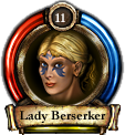 With all that in mind, we decided that we really just wanted to display the portrait, and the health and mana bars at all times, along with the hero’s name and a small digit that represents the character’s level. Character states, such as poison, paralyzation, etc can be easily color-coded into the portrait, or displayed as mini-icons alongside, and damage markers can be painted right over the portrait. All in all a pretty neat affair, I would say. For now… because who knows? Once will begin actually playing the game in earnest, we may find that our assumptions were wrong and that have to re-design the boxes once more, but such is the life of a game developer. It is the nature of the beast. Game development is an evolution, even after doing it for the umpteenth time.

 Comments:
Leave a reply